
On this page, you will find information and helpful tips on how to use the Clean Energy Solutions Index Dashboard.


The Clean Energy Solutions Index Dashboard allows you to explore the Index data for yourself in a visual and interactive format. This means you can view the results of the survey in charts and tables, as well as analyse the data using various data cuts, tables, and filtering.
The platform also allows you to export the Index results in various formats to use in presentations, documents, and reports.
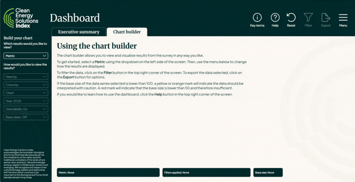
To navigate to the Dashboard, hover over ‘Latest Data’ in the top menu, then click or tap on ‘Dashboard’. The Dashboard featured two tabs: ‘Executive Summary’ and ‘Chart Builder’. You can switch between these two tabs by clicking the one that is not selected under the page heading.
From any Dashboard tab, you can navigate back to the Clean Energy Solutions Index website by using the menu in the top right corner.
Executive Summary
On the Executive Summary tab, use the dropdowns under the ‘How would you like to view the results?’ heading to toggle between geographic regions, time periods (years), and turn data labels or base sizes on and off (to reduce visual clutter, if required).
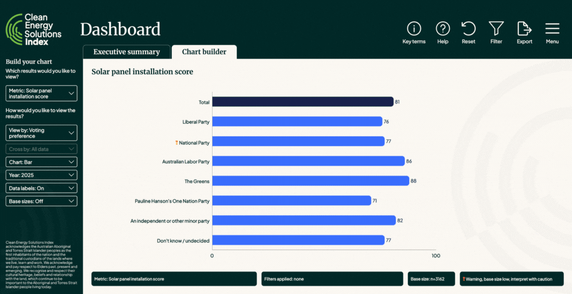
Chart builder
On the Chart Builder tab, start by using the ‘Metric’ dropdown under the ‘Which results would you like to view?’ heading to select which Metric you would like to display.
Once you have selected a Metric, use the dropdowns under the ‘How would you like to view the results?’ heading to manipulate how the data is displayed. Each of the dropdowns has a specific function:
You can also use the following features to interact with the data that is shown in charts and tables:
To open the filter menu, click or tap on the filter icon in the top right corner of the page. Once the menu opens, there will be several filters to choose from.
Clicking or tapping on each filter will open a drop down, allowing you to select your desired options. For example, you could filter by a specific age group by dropping down the age filter and selecting a specific age group.
You can apply multiple filters simultaneously. For example, you could filter by Females, in Victoria, who are 18-24 years of age.
Once you have made your filter selections, click on the apply button in the bottom left corner of the filter menu to apply your filter(s).
You can change filters any time by re-opening the filter menu, clicking reset, choosing your next combination of filters, and then clicking or tapping apply again.
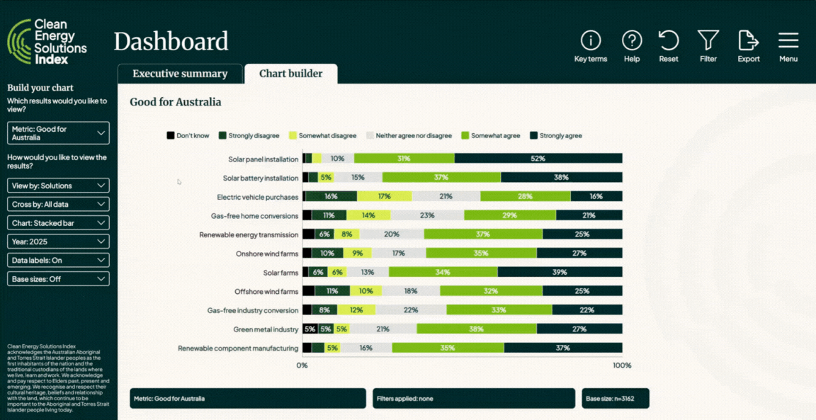
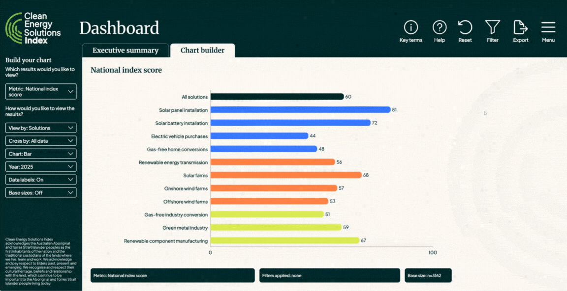
The Metric selected is shown in the Metric indicator, located in bottom left corner of the chart area.
The Filters you have applied are shown in the Filter indicator, located at the bottom middle of the chart area, next to the Metric indicator. When a Filter has been applied, the Filter information within the indicator will change, showing the specific Filter that has been applied to the data.
The Base size for the selected Metric, taking into account any Filters that have been applied, is shown in the Base size indicator, located at the bottom right of the chart area, next to the Filter indicator. This is the total Base size for the Metric. Base sizes for individual data series are displayed on the chart.
When the Base size for a question is low, the Base size warning indicator will display, and is located on the bottom right of the chart area, next to the Base size indicator. There are two base size indicators that you may see in the dashboard pages.

You can export the data that is shown on the dashboard page to PNG (image), PDF (document) or XLSX (workbook) format.
To export data, open the Export menu by clicking on the Export icon in the top right corner of the page.
Select the format you would like to export to. A dialogue box will open prompting you to save the exported file to your device. Select a location to save your file and then click save.
Please note that the export will export the entire page, including the metric, views, charts, etc. you have selected, and any filters you have applied.
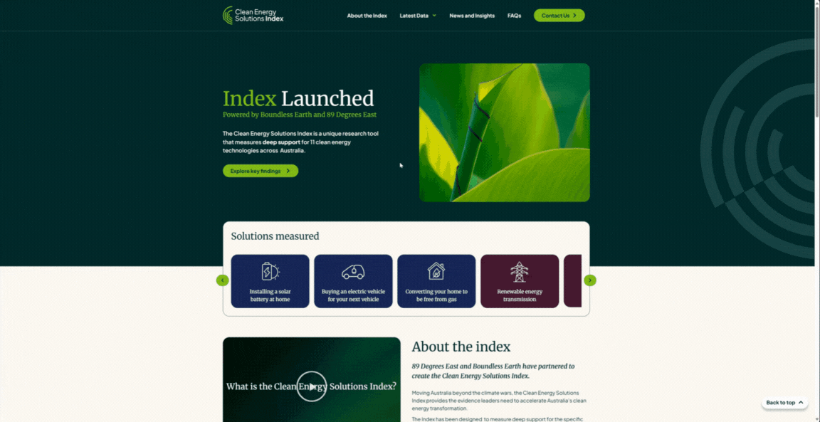
Explore the Clean Energy Solutions Index data for yourself through the interactive dashboard.